Data visualisation
Evalyzer optimizes test results analysis: spending long hours on watching videos is a thing of the past!
The tool is designed to calculate and display the essential indicators in a simple and dynamic way. The paths, success rates for a given task, failures and dropouts, navigation durations, all are available as interactive graphics.
Watch videos of your testers. With a single click, choose to watch interesting navigation behaviour.
With answers to your questionnaire and tester configuration, it is possible to identify users who had difficulties.
Watch videos of tester navigation as if you were there!
The replay interface embeds the video of tester's screen during the navigation with the captures of the web cam and the microphone. This video is downloadable.
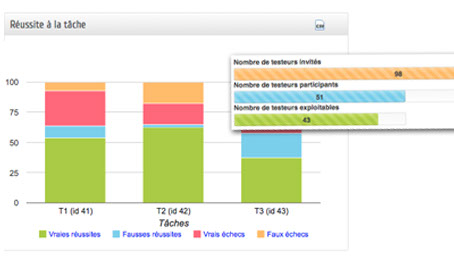
Analyze the success rate & check the participation
In real time, you are informed about the participation rate, the task success rate and many other things.
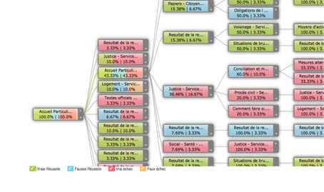
Immerse yourself in the navigation of participants
The tree path shows with details testers' navigation. You can filter the results by type of success.
Identify the interesting testers according to your criteria
Find disoriented testers or, conversely, those whose navigation is fluid, in order to understand why.
Characterise your testers
Understand who are those testers who succeeded or failed in a given tasks. The variables are those that you defined in your questionnaire.
Benefits in 3 points
- Saving considerable analysis time
- Unparalleled analysis accuracy
- Interactive tools, easy to use
Recommended reading :
- How to keep visitors on your site (infographic) New !
- Survey results: what is your UX testing practice (Infographic) Hot !
- What is User Experience ? (Infographic) Hot !
- 10 difficulties Users meet when surfing Part I (Infographic)
- 10 difficulties Users meet when surfing Part II (Infographic)